How we work
Every solution we deliver starts with an audit behind each build is a diagnostic first.
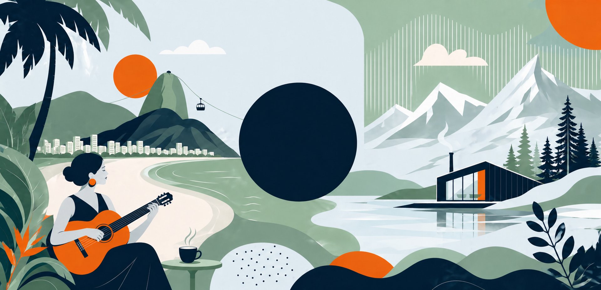
The Quiet Tension of Sound and Space
Bossa Norte was born into a landscape saturated with noise—platforms engineered for scale, not soul. The audit revealed a category drifting toward sameness, where algorithmic abundance had flattened identity and genres once rich with character had become ambient wallpaper. Jazz felt rehearsed, lo-fi felt diluted, and ambient felt distant. What listeners were truly searching for wasn’t more music, but a sense of place—something intentional, immersive, and emotionally articulate.
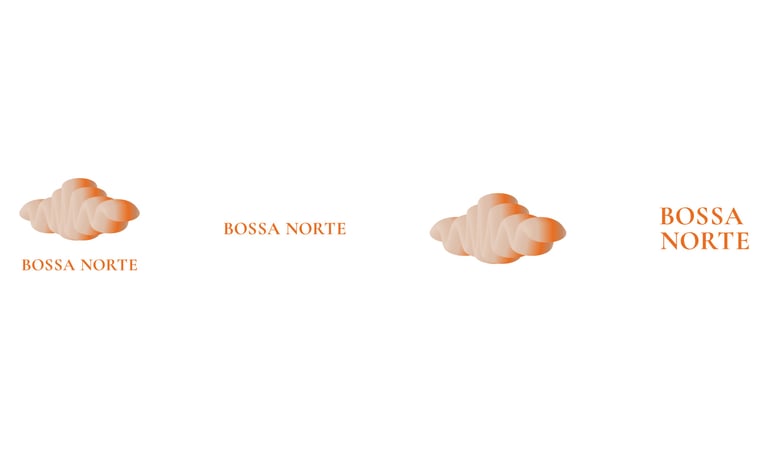
We refined Bossa Norte’s core—sunlit rhythm meeting quiet restraint, emotion held within space, cultures unfolding in balance—into a single, expressive form. A unified mark merges flow and stillness, suggesting motion without urgency. Soft amber tones introduce measured warmth. An identity that moves gently, with the same clarity and control as the sound it frames.
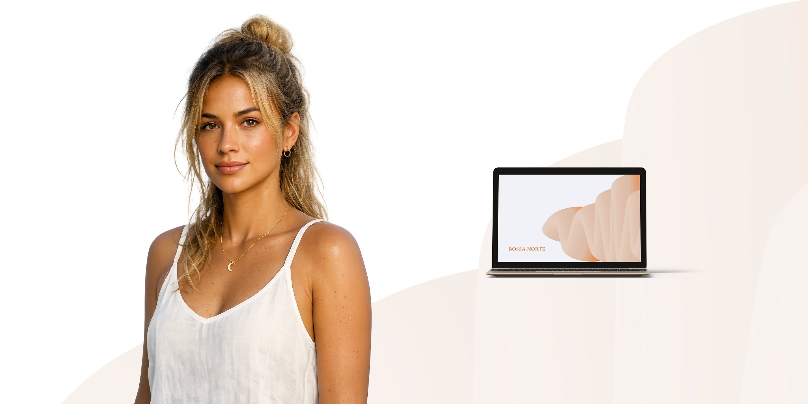
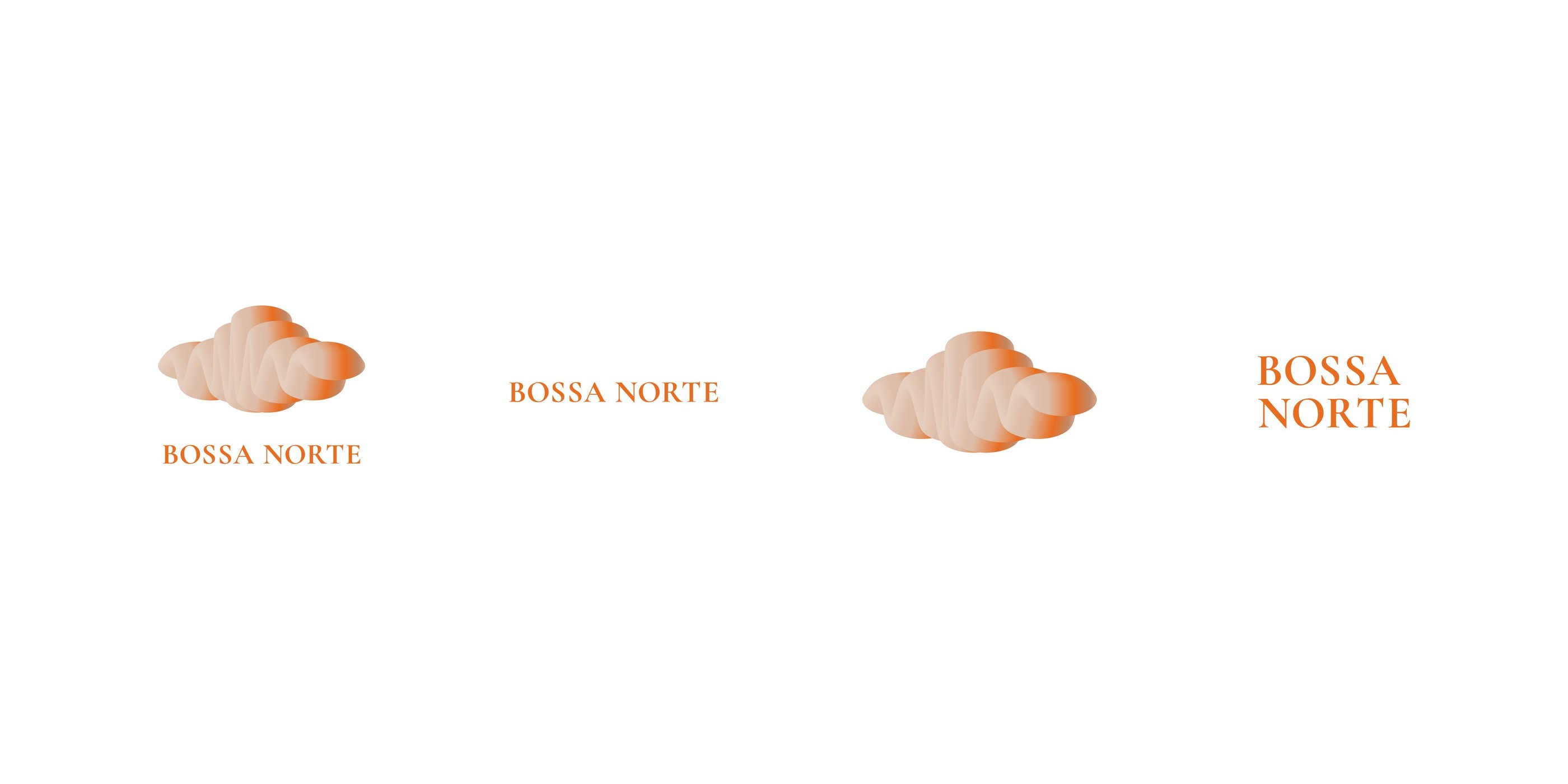
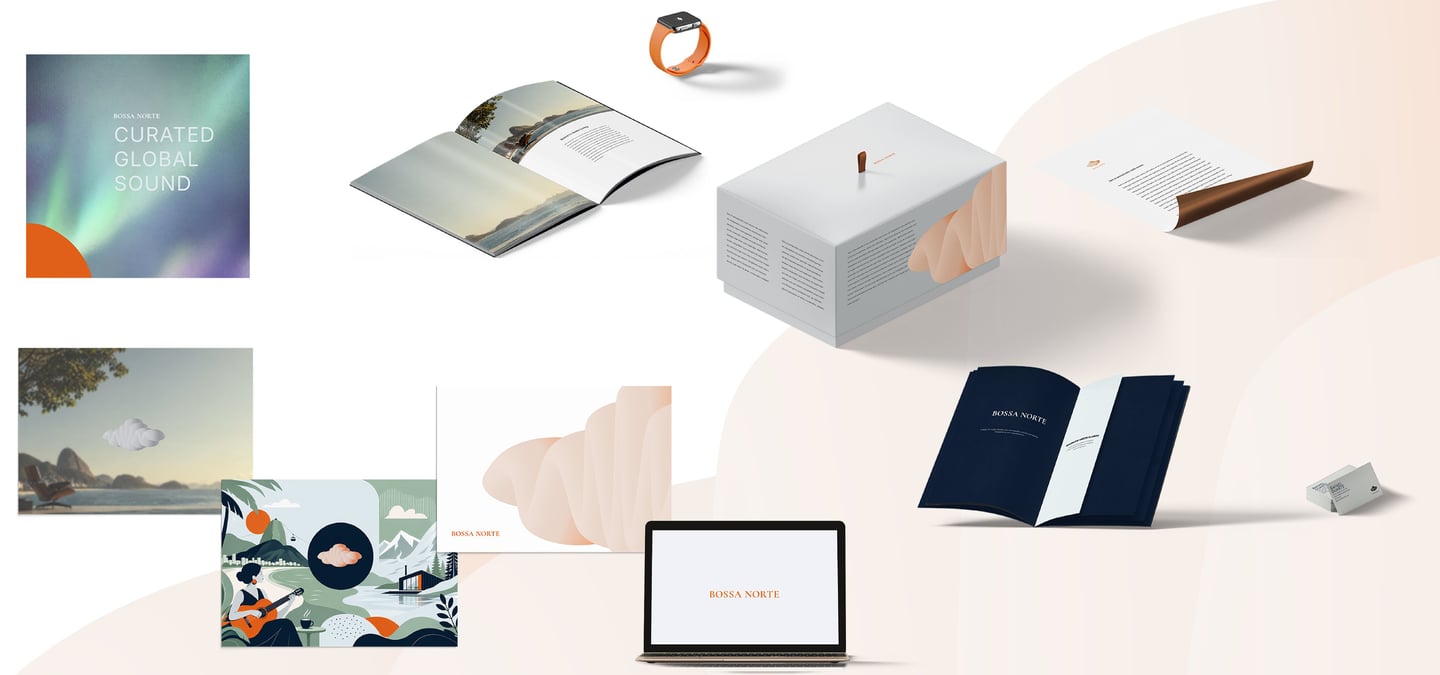
Brand Marks
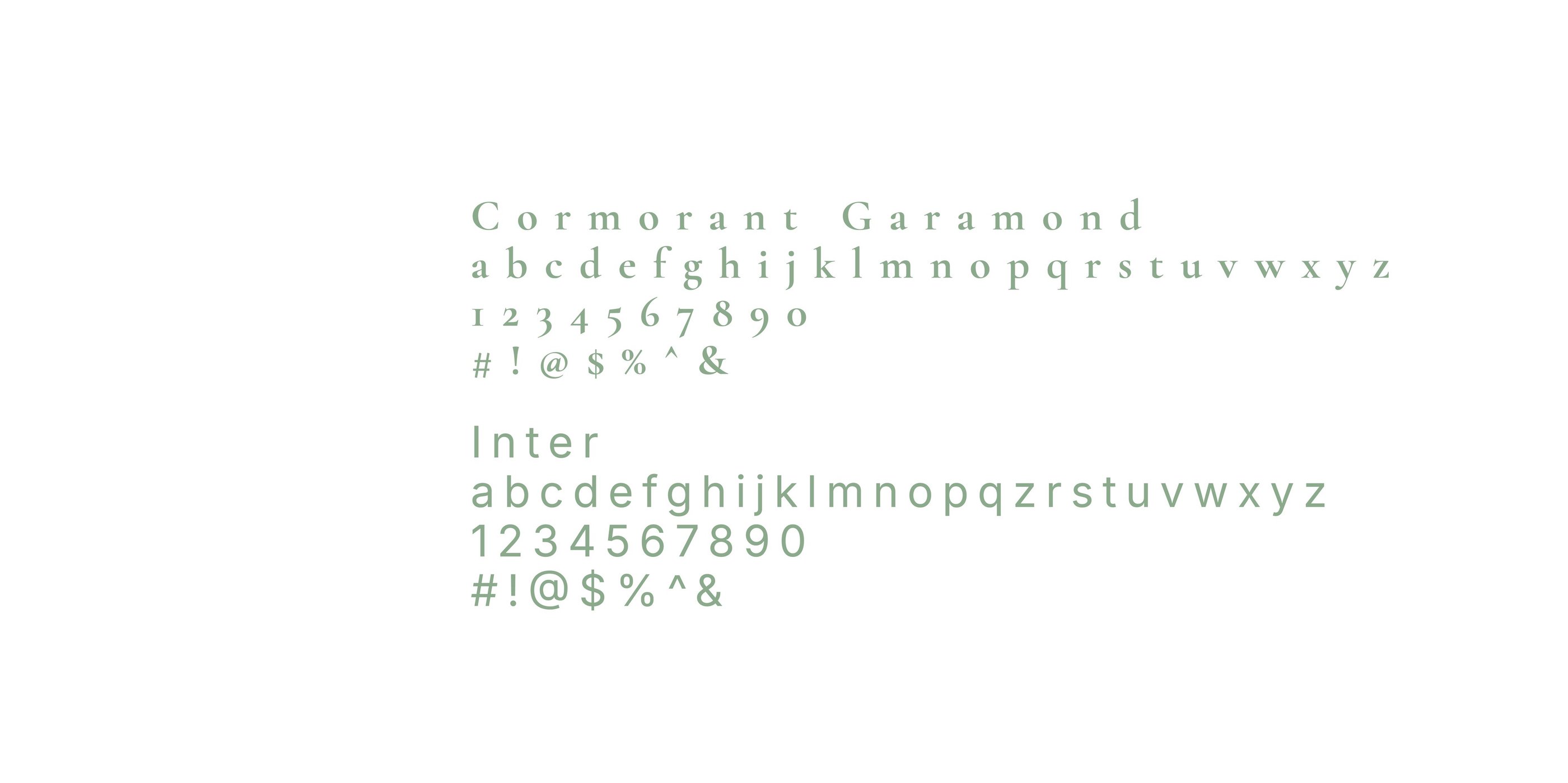
Typography
We selected two typefaces that balance precision with purpose.
Cormorant Garamond — a refined serif typeface that channels the spirit of classic Garamond designs through a more expressive, contemporary lens.
Inter — a functional humanist sans-serif built for dashboards and high-info environments. Readable at small sizes. Legible under load. Always clear.
Together, they speak the same language: structured, calibrated, confidently Driftlynk.
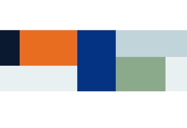
Color Palette
We built a palette that performs—visually and operationally.
Midnight Fjord (#0A192F) the anchor. A deep, inky blue that establishes calm authority and spatial depth.
Burnt tangerine (#E86D20) — a rich, confident orange with enough red depth to feel premium rather than playful.
Polar Ice (#E8F0F2) The breath. A crisp, near-weightless off-white that introduces clarity and openness.
Golden Caipirinha (#F4A261) The pulse. A controlled warmth drawn from Brazilian sunlight and citrus tones.
Sage Tundra (#8BAA8C) The bridge. Muted green that connects organic warmth with Nordic restraint.
Terracotta Coast (#D97A5C) The depth of warmth. Earthier and more grounded than the golden tone, this color evokes clay, coastlines, and sun-warmed surfaces.
Silver Aurora (#C0D4D9) The shimmer. A cool, metallic-leaning accent that introduces light and movement in a restrained way.
A color system that doesn’t just look balanced—it feels like Bossa Norte sounds: composed, atmospheric, and quietly alive.

"Our intention was clear: create an identity that feels the way Bossa Norte sounds. A brand for listeners who seek atmosphere, clarity, and emotional depth—without noise or excess." — Mlibo Bottoman, Creative Director
Credits
Client: Bossa Norte, Online Radio Staion
Studio: Umbu Kerubi
Deliverables:
Brand Statement
Value Preposition Statement
Brand Almanac Strategy Document
Visual Identity Starter Kit