Automating the Flow of Logistics
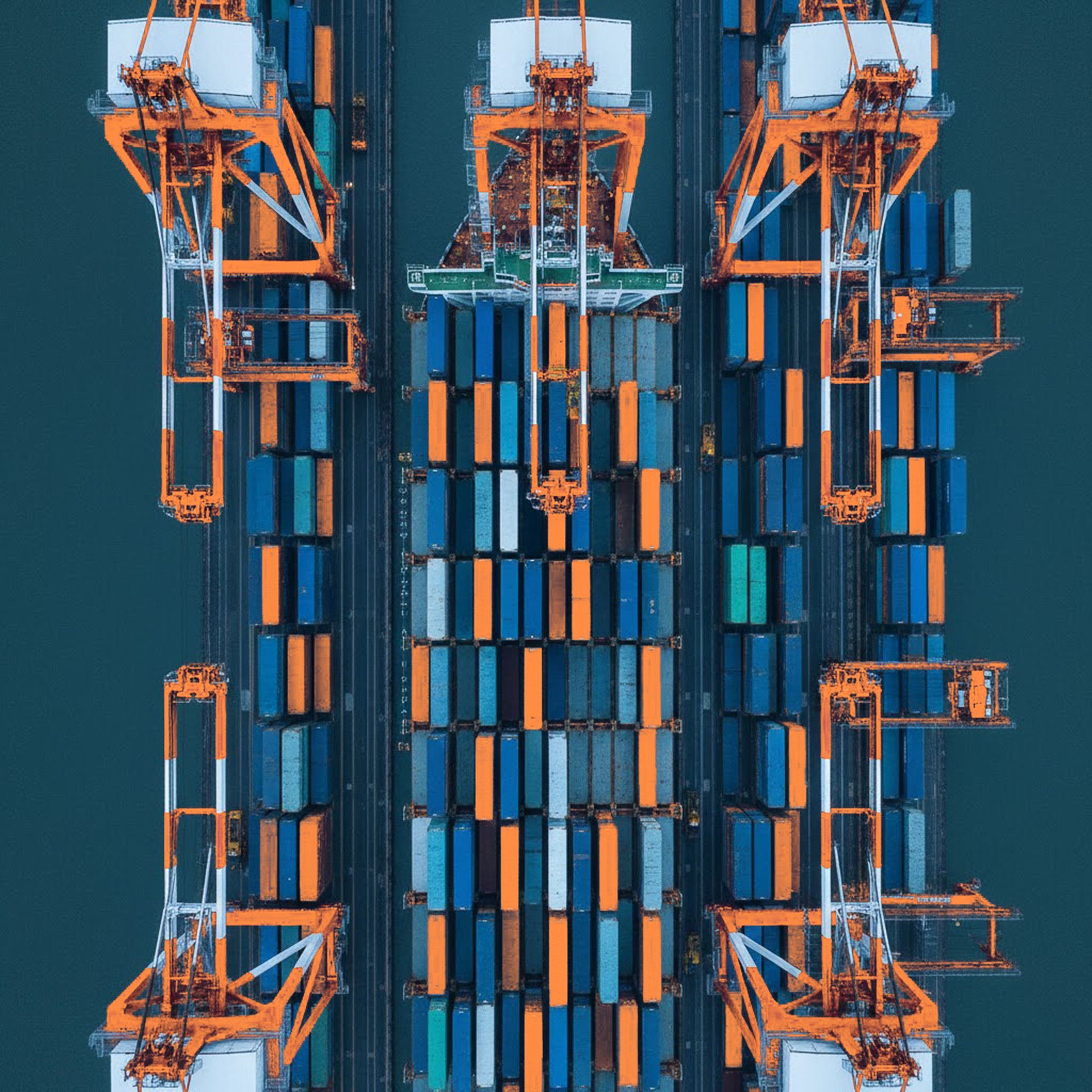
Driftlynk helps logistics teams move faster—across warehouses, across systems, across continents. Their workflow automation engine now processes over 50,000 shipments monthly, turning manual chaos into calibrated precision.
We partnered with Driftlynk to translate their engine into identity.
The process began with clarifying their positioning, crafting their visual language, and building a system that communicates control at every touchpoint. From color psychology to interface textures, every element reinforces one truth: friction replaced by flow.
The result is a complete brand identity—one that reaches every dashboard, every dock, every decision—and positions Driftlynk as the invisible backbone keeping complex supply chains in rhythm.


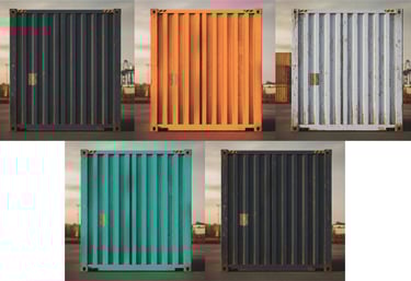
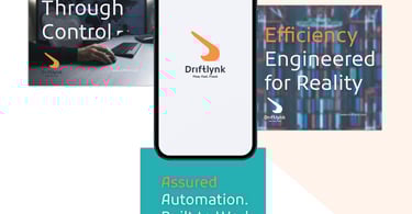
We distilled Driftlynk's essence—seamless automation, real-time precision, scalable flow—into a single kinetic mark. An interlocking form signals handoffs in motion. Signal Orange pulses with actionable energy. Steel Slate grounds it in control. A symbol that moves as fast as the logistics it powers.
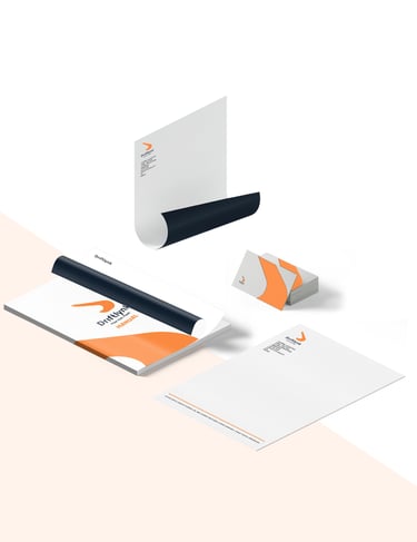
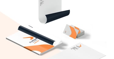
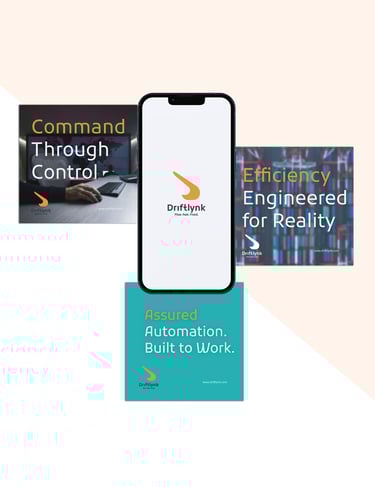
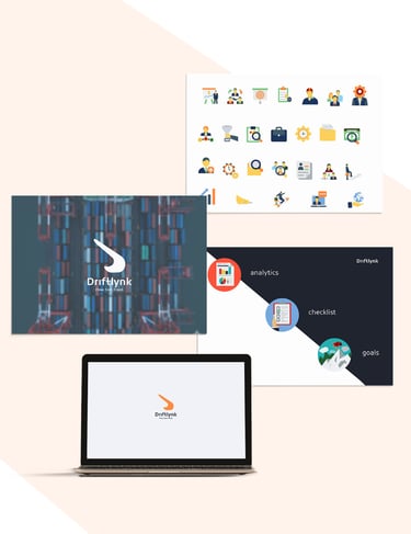
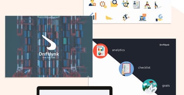
Brand Marks
Typography
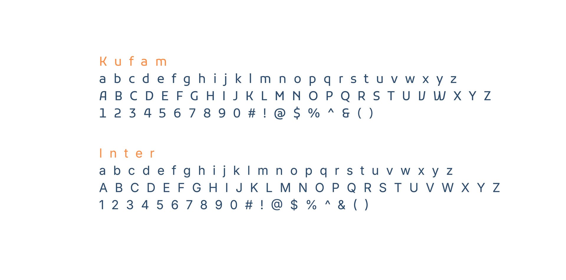
We selected two typefaces that balance precision with purpose.
Kufam — an industrial-modern sans-serif that echoes control rooms and clear hierarchy. Bold. No-nonsense. Tight letter spacing for compact efficiency.
Inter — a functional humanist sans-serif built for dashboards and high-info environments. Readable at small sizes. Legible under load. Always clear.
Together, they speak the same language: structured, calibrated, confidently Driftlynk.
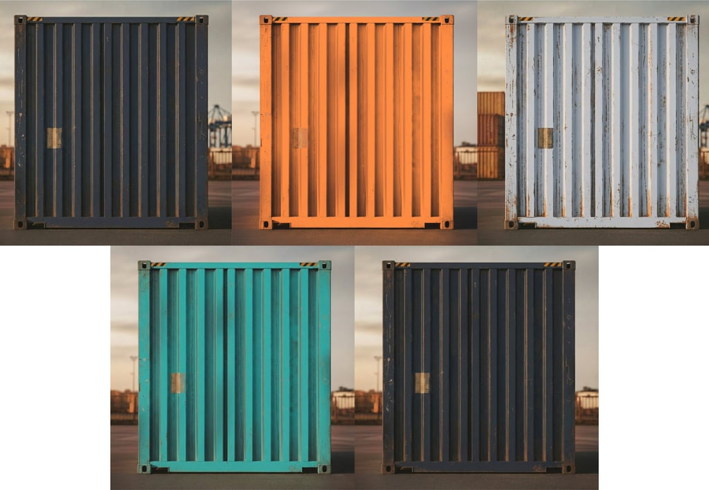
Color Palette
We built a palette that performs—visually and operationally.
Steel Slate (#2F3846) grounds the brand in enterprise-grade reliability. Authority. The foundation.
Signal Orange (#FF8C42) delivers actionable energy. Alerts that inform without alarming. Urgency. Attention. Clarity.
Clean White (#F0F2F7) breathes readability into every interface. Whitespace that lets information breathe.
Circuit Teal (#26B0B3) signals connectivity in motion. Flow. Sync. Systems humming together.
Graphite Shadow (#1F242E) adds depth for hierarchy. Layers. Structure. The invisible backbone made visible.
A system that feels authoritative yet nimble, predictable yet adaptive—unmistakably Driftlynk.
"Our goal was simple: design an identity that feels like Driftlynk actually works. A brand for logistics teams who demand control, clarity, and flow—without the friction." — Mlibo Bottoman, Creative Director
Credits
Client: Driftlynk
A B2B SaaS company offering workflow automation for logistics.
Studio: Umbu Kerubi
Deliverables:
Brand Statement
Value Preposition Statement
Brand Almanac Strategy Document
Visual Identity Starter Kit