Engineering a Sustainable Future
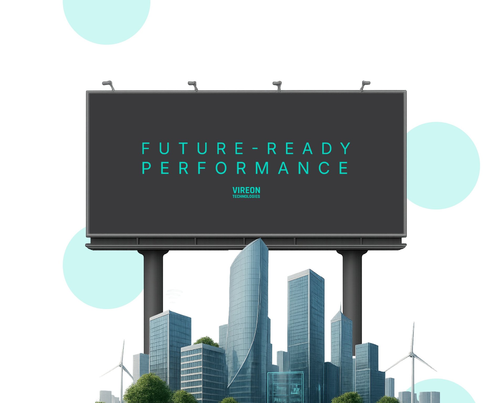
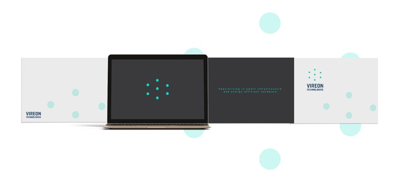
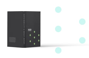
Vireon Technologies powers smart infrastructure across three continents—delivering energy-efficient hardware that helps cities run cleaner, buildings think smarter, and companies compete harder.
We partnered with Vireon to bring their technology story to life.
The process began with clarifying their value proposition, crafting their visual language, and building a system that communicates intelligence at scale. From color psychology to texture studies, every choice reinforced one idea: precision meets purpose.
The result is a complete brand identity—one that reaches every touchpoint, from control rooms to boardrooms, and positions Vireon as the clean energy edge in a world of complexity.
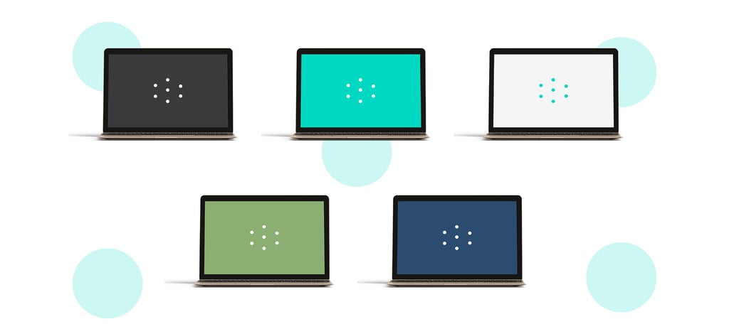
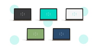
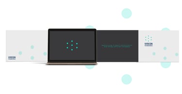
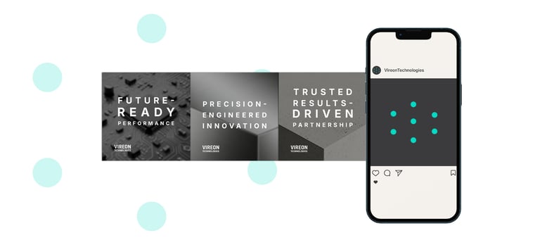
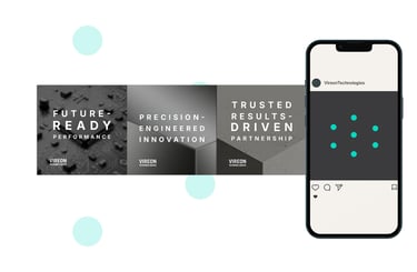
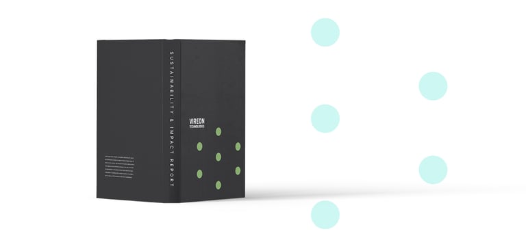
We distilled Vireon's essence—smart systems, sustainable energy, scalable solutions—into a single structural mark. Circular forms signal precision. Electric Cyan pulses with clean energy. Graphite Grey grounds it in trust. A symbol that works as hard as the hardware itself.
Brand Marks
Typography
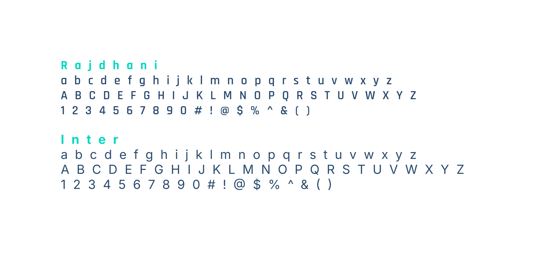
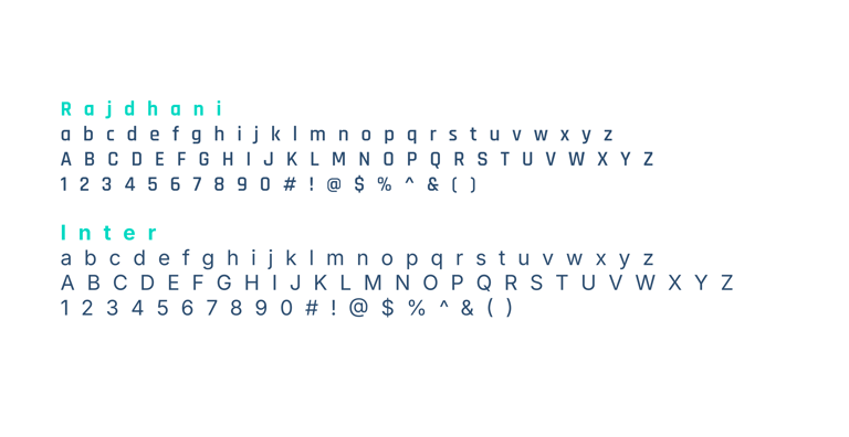
We selected two typefaces that balance intelligence with humanity.
Headers: Rajdhani — a sleek geometric sans-serif that echoes infrastructure and precision. Clean lines. Modern proportions. Unmistakably tech-forward.
Body: Inter — a humanist sans-serif built for readability across screens and scales. Approachable. Clear. Always legible.
Together, they speak the same language: structured, accessible, confidently Vireon.
Color Palette
We built a palette that performs—visually and functionally.
Graphite Grey (#3A3A3C) anchors the brand in sophistication and reliability. The foundation.
Electric Cyan (#00D8C2) signals clean energy in motion. Intelligence. Innovation. Pulse.
Matte White (#F5F5F5) breathes purity into every composition. Minimalism with purpose.
Olive-Tinted Green (#8BAE73) whispers eco-efficiency. Never loud. Always present.
Steel Blue (#2B4C6F) delivers tech-forward trust. Depth. Stability. Vision.
A system that feels smart, sustainable, and unmistakably Vireon.
"We wanted to create a visual identity that was a genuine reflection of what Vireon represents. A brand built for smart infrastructure, sustainable energy, and the people building tomorrow—today." — Mlibo Bottoman, Creative Director
Credits
Client: Vireon Technologies
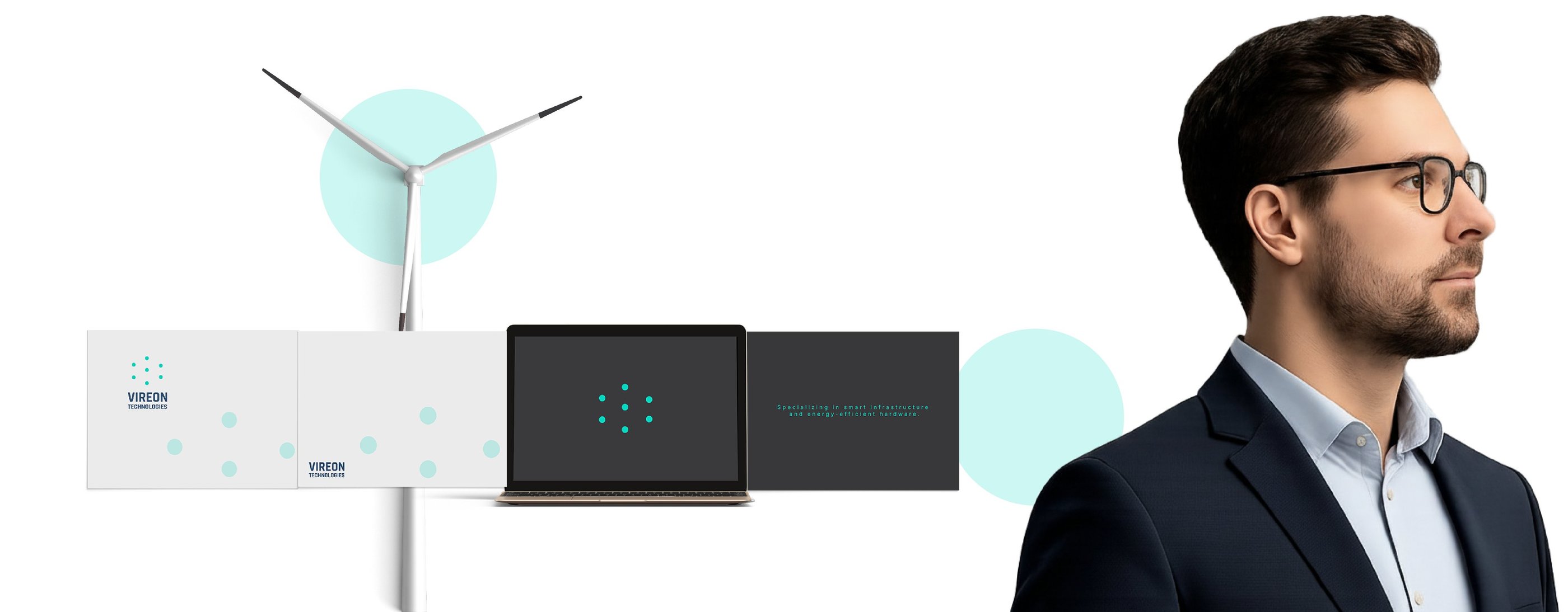
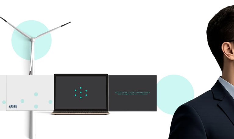
Specializing in smart infrastructure and energy-efficient hardware
Studio: Umbu Kerubi
Deliverables:
Brand Statement
Value Preposition Statement
Brand Almanac Strategy Document
Visual Identity Starter Kit